The art of tattooing goes beyond merely inking the skin.
It's about creating a lasting impression that connects with the person wearing the tattoo and those who see it.
Understanding visual hierarchy, composition, and the ability to guide the viewer's focus are key components to a successful tattoo design.
This blog post will outline four fundamental considerations to help guide tattoo artists in their creative decisions:
- Visual Hierarchy
- Strong Silhouette
- Contrast
- Avoiding Composition Killers
The goal is to provide both seasoned tattoo artists and those new to the field with insights into creating a custom tattoo design that is both beautifully composed and delivers the desired impact.
It's worth noting that the design principles that will be discussed originate from illustrative art principles. Therefore, these considerations may be more applicable to some illustrative tattoo styles, such as traditional and neo-traditional tattoos, more than other tattoo styles that may not require such considerations.
Visual Hierarchy in Tattoos: Guiding Focus and Readability
The first thing a tattoo artist should consider when looking at their custom tattoo design is the visual hierarchy.
- What do I want the viewer to look at first, and where should they go from there?
- What is the main subject of the tattoo, how is it prominently featured?
- What are the supporting elements, and how are they represented in comparison?
All the required design elements should be ranked based on their importance in the tattoo. Having a visual hierarchy will allow artists to start making informed decision choices to draw attention where it's needed.
When sketching the composition of a design, consider the size of your individual elements. If they're similar in size, there's a risk the elements may fight for attention.
To improve a design's visual hierarchy, adjust the size hierarchy to ensure that the main subject commands attention, and the supporting elements bring the overall tattoo design together.
Strong Silhouette Creation: Techniques for Enhancing Recognizable Imagery in Your Tattoos
The second thing a tattoo artist should consider when designing is the silhouette. The subjects of a composition should be represented with immediately recognizable images and shapes.
Think about the archetypal imagery of what you are drawing. Each subject has key identifying features that can be accentuated by the pose and perspective of the subject. A strong silhouette will have these identifying features that can be recognized by the viewer, even from a distance.
Now think back to a recent tattoo design you’ve done:
Was the subject posed in such a way that the silhouette created was a clear indication of what the image is?
The example pictured below shows two versions of traditional panther skin tear tattoo designs.
The traditional panther on the left (rendered design from Angry Animals by Aaron Francione) has a strong silhouette that includes clear indications of the panther's strongest features.
The tattoo on the right (artist unknown) does not have a strong silhouette and is significantly more difficult to understand as the distinguishing features of the panther are not clearly defined.

In your tattoo design process, after you’ve determined your visual hierarchy, you can experiment with your subjects’ silhouettes by creating a series of thumbnail sketches before committing to a final drawing. These thumbnail sketches will help you determine which compositions create the most recognizable silhouettes.
There may only be a few basic forms/poses of an object that give it the strongest shape, but if you focus on picking the best silhouettes for your subjects, you’ll have an easily readable tattoo.
Ideally, anyone who sees the tattoo for years to come should be able to step back 5-10 feet and know exactly what they’re looking at.
Contrast for Impact: Depth and Legibility in Tattoo Design
Next up is contrast. Pushing the range of multiple types of contrast throughout a design will reinforce the visual hierarchy, strengthen your silhouette and legibility, and create depth.
Building up contrast is essential to guide the viewer through a complex image. High or even max contrast will draw focus to a main subject, while secondary areas of focus should utilize less contrast. Explore all of the available options of contrast to improve your design.
We’ve already discussed contrast of size, but there’s also contrast of focus, contrast of texture, contrast of style, contrast of positive/negative space, and most importantly, contrast of value.
It’s important to establish your value range throughout the design.
- Think of your values on a scale from 0-10
- 0 being skin tone or a white highlight and 10 being solid black.
- Give a full range of values to the main subjects and their silhouettes
- This emphasizes importance and grabs the viewer’s attention first
- Lessen the range of values as you work through your visual hierarchy
Once your value range is in place, you can push your contrast further with intense and dull colors.
Using full saturation or full chroma in every part of the tattoo design will overwhelm a viewer's eye. You can experiment in your color study by choosing just one color that you want to make really pop and desaturate the rest of your colors to create consistent contrast that will demand attention where it’s needed.
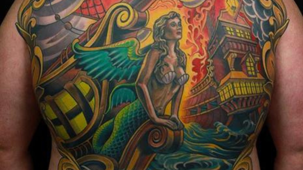
Pictured below is a back piece tattoo by Russ Abbott that uses contrast to guide viewers through a very detailed design.
Notice that the mermaid nautical figurehead is the largest element, the visual hierarchy is reinforced by applying a full range of values and color, and the silhouette is emphasized with contrast along the edges.
The remaining supporting elements receive varying levels of lesser contrast to direct the eye's path through the entire tattoo design.

Avoid Tattoo Composition Killers that Might Compromise the Integrity of a Design
The most prevalent composition killer is tangent lines or kissing lines.
These are lines that touch or come close to touching and do not overlap, creating an awkward visual connection. This can lead to confusion and make it challenging to distinguish the individual elements, affecting your visual hierarchy and silhouette.
Instead, redraw the tangent lines to be overlapping or separate and create a clear distinction between the two objects. Even further distinguish between objects by adding some type of contrast such as size or color.

Another composition killer can be the balance of a tattoo design. The orientation and distribution of the elements in a tattoo design can affect the overall harmony and impact on the viewer.
A well-balanced composition ensures that the components of the tattoo design are distributed in a visually appealing way.
There are several guidelines that are commonly used for creating a well balanced composition:
- Law of Thirds

- Dynamic Symmetry

- The Golden Triangle

- The Golden Ratio

Use these frameworks to guide choices for your design element placements and testing different compositions in your sketching process.
The last composition killer to avoid is not designing for placement.
Where the tattoo is placed on the body plays a major role in the viewing experience of the tattoo. Some placements on the body may be seen from various angles during natural movements and poses or be partially exposed from clothing.
The design should be sketched and drawn on a body template, such as Tattoo Smart’s Body Shots line drawing body templates, Protoplast 2D body templates, and Model Human 3D model body templates.
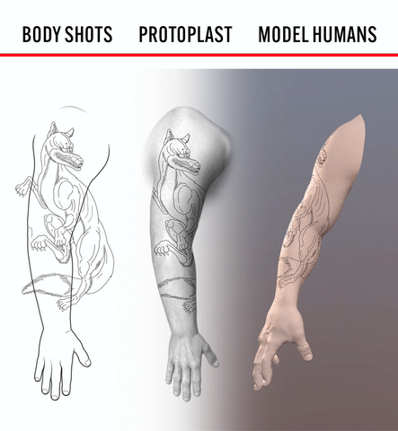
Designing on a body template will help you ensure that the tattoo still reads well from all possible ways of being seen.
CONCLUSION
As a tattoo artist, creating visually striking and well-balanced designs is crucial to delivering successful tattoos that captivate viewers.
To achieve this, following a checklist of essential principles and ideas can help tremendously in the design process:
- Establishing a clear visual hierarchy ensures that the main subject and supporting elements are appropriately emphasized.
- Strong silhouettes enhance the immediate recognizability and appeal of the tattoo, ensuring its readability from a distance and as it ages.
- Leveraging contrast in various aspects of a tattoo design, such as size, value, and color, guides the viewer’s journey through the image and adds depth.
- Finally, avoiding composition killers, like tangent lines and unbalanced placements, ensures the aesthetic and harmony of the design.
By incorporating these considerations into their design process, tattoo artists can elevate their work and create tattoos that leave a lasting impression on both the client and the viewer.
Check out this clip to see these ideas be applied in real time!

