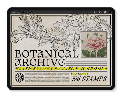
Introduction: A Painter’s Mindset in a Digital World
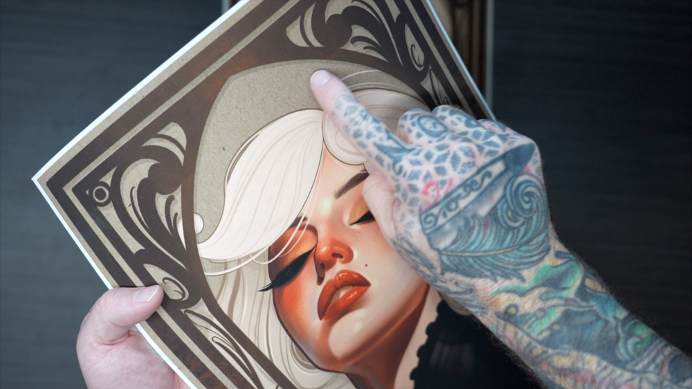
Digital tools have transformed the way tattooers design. With an iPad and the right brushes, you can sketch, paint, and refine flash designs faster and more fluidly than ever. But when it comes time to bring that artwork into the real world as a print—something you can frame, gift, or showcase at your station—a lot of artists are surprised by how different the result can look.
Colors shift. Textures flatten. And that magic you saw on your screen? Sometimes, it gets lost in translation.
This post is about fixing that. It’s about how to design digital flash that holds up when printed. And it starts with how you treat the digital surface you paint on.

Why We Photograph, Not Scan
When we created The Spitshade Set, our first goal was to recreate the feeling of painting on real paper. That started with real materials. We stained heavyweight Arches watercolor paper using coffee and tea, then photographed each piece in controlled lighting to preserve every subtle shadow, wrinkle, and stain.
 With The Washi Set, we took that concept even further. We sourced 17 different handmade Japanese papers, each with its own texture and character. Again, we didn’t scan them. We carefully photographed them to preserve the real-world depth that flat scans miss.
The result? You’re not painting on a blank canvas—you’re painting on photographed paper that already feels alive.

Two Sets, One Purpose: Complementary Toolkits
The Spitshade Set and The Washi Set are designed to reflect two traditions:
- The Spitshade Set captures the look of gritty, Western traditional flash.
- The Washi Set channels the elegance of Japanese woodblock and scroll aesthetics.
Each set comes with its own set of Procreate brushes, designed to behave like their analog counterparts. But here’s the key: they work beautifully together. You can use Washi brushes on Spitshade paper and vice versa. Combining the two opens up a new world of hybrid styles that blend Western boldness with Eastern subtlety.
Understanding Pro-Mode Layers
One of the unique features of our digital paper sets is the addition of "Pro Mode" layers. These are designed to simulate light interaction with real paper surfaces, helping your digital artwork feel more tactile and dimensional.
There are two key layers in Pro-Mode:
Paper Sheen (Screen Mode): This adds the appearance of light reflecting off the surface of the paper. It’s especially noticeable in darker areas, where it prevents pure black from going flat and instead reveals subtle grain and simulated highlights.
Paper Shadow (Linear Burn Mode): This enhances the depth of the paper’s texture by allowing the darker parts of the photographed paper to show through your artwork. It’s particularly useful if your painting workflow doesn’t rely heavily on blending modes like Multiply or Darken.

Pro Mode is a visual enhancement tool for screen use—but that doesn’t mean you have to turn it off completely for printing. Instead, consider adjusting the opacity of each layer to find a balance that suits your print output. For some designs, lowering the Paper Sheen and keeping a touch of Paper Shadow can retain the artwork’s depth without introducing unwanted lighting artifacts.
Comparing Options: Pro-Mode ON or OFF?
When Matt Truiano sent us two versions of his artwork titled Yokono —both created using The Washi Set—we noticed something subtle but important. The dark tones on one version looked rich and balanced. The other? The dark areas looked like they were reflecting light.

The difference? In the second print, the Pro Mode layers were left on at full strength.
So here’s the takeaway: Pro Mode is powerful, but context matters. Before printing, test a few variations. Dial back the Paper Sheen, check how shadows translate to ink, and make sure the final export feels intentional.
![]() A Hokusai Reimagined
A Hokusai Reimagined
To really test The Washi Set, Russ Abbott recreated a masterwork: the iconic Hokusai Falcon. Using a combination of Washi brushes and one of the more fibrous paper textures, Russ painted the entire piece digitally on the iPad.

Then we printed it.
Because the underlying texture was based on real photographed paper—and because we carefully controlled the Pro-Mode layers before export—the final print felt authentic. Not just a digital copy, but something you’d proudly display alongside original hand-painted flash.

Final Thoughts
Whether you're building gritty old-school flash or elegant Japanese compositions, the goal is the same: digital flash that feels analog.
The Spitshade and Washi Sets were designed with that goal in mind. Each set stands alone, but together they give you the full range of traditional influences to create art that translates beautifully from screen to paper.
Want your prints to feel as real as your tattoos? Start with the right tools.
Have questions about The Spitshade Set or The Washi Set? Contact support@tattoosmart.com.